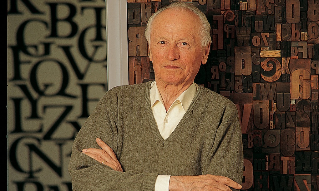
Obituary for Adrian Frutiger, published in the Guardian, 5 October 2015.
Frutiger attributed some of his skills to the genes he inherited from his ancestors among the farming communities of the Bernese Oberland in Switzerland, where there is a craft tradition of making paper cutouts and silhouettes. After days spent tending livestock or cutting hay, men and women in the region would show remarkable dexterity, using scissors to cut pieces of thin black paper into depictions of scenes from their daily lives. Many of Frutiger’s designs were constructed using large paper proofs that he would then trim with scissors and a knife, shaving a millimetre here and there until he had reached the result he wanted. The letters in all his work show this attention to detail and are always open and clear, allowing the message they convey to be understood without impediment. “Type is the clothing a word wears, so it must be subordinate to the content,” he said.
Read more.