Cambridge Ulysses edition let down by poor production choices

9781316515945jvs12 600px

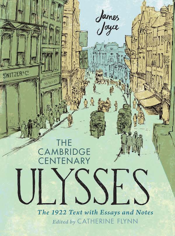
I was very pleased to be given a copy of the new Cambridge edition of Ulysses as a Christmas present. In a handsome large format and weighing in at over 4kg, it’s an imposing volume. I’m a sucker for this kind of volume – a book about the making of a book: a facsimile of the original edition, accompanied by notes and other bibliographical references.

However, for all its grand design, I believe that the book’s overall effect is let down by some poor design decisions and use of inferior quality paper.

General IMG_4791 960px

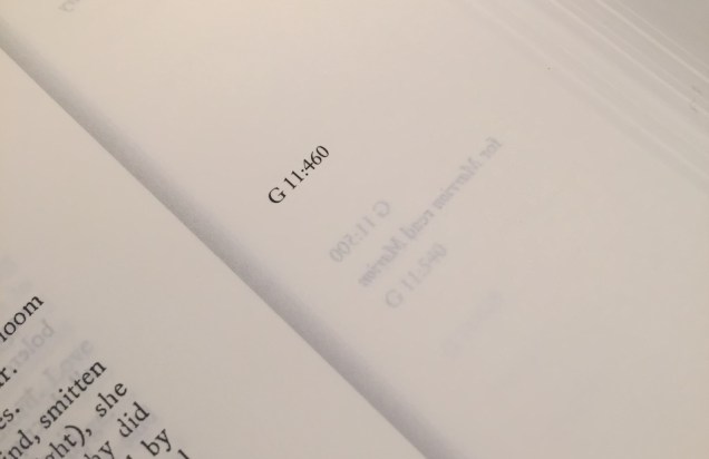
You can see the basic design from the spread shown above. The novel’s facsimile is run in spreads on each side of the gutter, and the text of the annotations is in two, or sometimes three, columns underneath. It’s a neat touch to align the annotations with the left hand margin of the recto page of the facsimile. The numbers beginning with G shown in the left and right foredge margins refer to the line numbers of what Joyce scholars call the Gabler edition of 1986, widely regarded as definitive. These margins are also used for Joyce’s own errata notes.

However, you can see immediately the problem with the back margin. It is so small that the type is running into the gutter, and therefore difficult to read. This is a spread from roughly the middle of the volume, but with such a heavy book the effect is even worse on spreads near the beginning and end. In the meantime, the foredge margin is so generous that it has an acre of empty space on almost every page.

Showthrough IMG_4792 960px A quick glance at these shows terrible showthrough on every page, as can be seen above. Showthrough is a real problem throughout as can be seen again in the image below, which shows what happens on commentary section pages which have illustrations or maps.

Showthrough2 IMG_4797 960px

Because the commentary sections follow the same margin arrangement as the facsimile, the back margin is far too small, making it difficult to follow the text. Again, this problem is exacerbated in the sections nearer the front or back of the volume, as can be seen below:

Commentary IMG_4802 960px

It would have only required a small adjustment of the back margins to improve the design and resolve the problem of the text disappearing into the gutter. I cannot be sure but it may well be that the problem may have arisen because of a decision to use the same back margin as the 1922 text, with its much narrower page width. An extra 5mm back margin could easily be taken from the generous foredge with no effect on the overall line length.

My final production point of disagreement may be linked. This concerns the difficulty of actually reading the book. When it is placed flat on a table, my copy only remains open when reading between pages 220 and 740. If I don’t hold the edge down when reading pages before or after this range, the book closes with a thump. This is caused because the book block is bound too tightly to the boards for its weight and size.

It’s sad that these design and production defects spoil the overall effect of what is otherwise a handsome and useful contribution to the chequered publishing history of what I’m told is a literary masterpiece. (See this article by Stacey Herbert for the book’s production history.) I read most of Ulysses in the summer of 1969, when the Penguin edition was published, but I confess I never got to the end. I am looking forward to finding the time to tackle it again sometime soon. I’m ready, my kitchen table is ready, and I will do my best to complete the project. Wish me luck.

Read more about this edition in this Irish Times article by its editor Catherine Flynn.

Advertisement

Ramsden’s ‘Don’t Mention The War’ notes

Ramsden Germans

Looking for something to read in the inevitable queues on a couple of upcoming journeys, I took John Ramsden’s 2006 book Don’t Mention the War down from my shelf. I had glanced through it a decade or more ago when I bought it, but never read it right through. I’m glad to say that it is a terrific, easy read and I will get round to writing more about it when I finish it. But in the meantime, I want to write now about the defect in book production which pushed the footnotes out into cyberspace, and the inevitable consequences.

When I bought the book, I noticed this ominous sentence at the start of the bibliography: ‘ The note section can be found on the Internet at http://www.johnramsden-dmtw.co.uk. ‘ I recall checking this website out, and may even have downloaded the text. However, God knows where I filed it. Probably on the computer I was using then – four or five computers ago.

Little Brown’s decision was a bit unusual, even then, and seems to have led to a certain amount of discussion. Someone called Dan (who I take to be the historian Daniel Todman who was a colleague of Ramsden’s at Queen Mary) wrote on the Airminded blog that there had only been a handful of complaints. However, I reckon this misses the point.

This is because when, sadly, Ramsden died in 2009 only a year into retirement his website eventually vanished along with the link to his notes. So now all you get is an error message.

So I did a bit more Googling, this time of the website address, and came across this Twitter post from the Cambridge historian Ben Griffin:

Ramsden notes Twitter

Thanks Ben. I rushed to the Web Archive link and found Ramsden’s original post. I downloaded the notes, made them up into a PDF and printed them out. So now I have something I can at least tuck into the back of the book when I put it back on the shelf.

As to Ramsden himself, he seems to have been an intriguing man. A writer about the Conservative Party, but also an active Tory himself who had even done his time as leader of the council in the London Borough of Redbridge. There are some lovely tributes to him online, including this obituary in the Guardian by Peter Hennessy, a blog post by Bob Jones and a piece on Conservative History Journal.

Ramsden notes

So just in case the WebArchive itself goes under (unlikely I know, but you never know) as a public service I decided to post my own printable 19 page PDF of the notes (shown above) for anyone to download. If everything works OK, you should be able to get them from here:  Ramsden notes

Respect and respectability

I am reading and much enjoying Lynsey Hanley’s book, Respectable, about social class in Britain. Like her, I read Richard Hoggart’s The Uses of Literacy at quite a young age although with my solidly middle class background I did not feel, as does Hanley, that Hoggart could have been writing about my own childhood.

However, it’s not the content that I want to write about here. Rather, it’s the book production standards which display a slackness one would not have expected from a firm like Penguin. Here is a spread:

Just how did the quoted matter on the left hand page slip through the proofing process? You would think that anyone with half a book production brain would spot that it is set in Times – especially so when there is quoted matter on the right hand page, set correctly in Bembo. In case you think I’m being unnecessary picky, there are actually several instances of this in the book – I’ve chosen to show the one where there are two pieces of quoted matter on a double page spread.

The typography in the book is actually very classical in style and quite nice, and I’m glad to see that Penguin still provides the typeface name on the title page verso. Quite why the book is set in a typesize of 11.76/14.76pt is, however, a bit of a mystery. How would you happen on such an odd size?

Mass book production has always depended on fast turnaround but you do expect good practise from the firm whose high standards were set by one of the greatest 20th century typographers. Hans (‘Half-Point’) Schmoller would not have been amused.

Indexer, hooray for the

Today is National Indexing Day: a day of celebration for all those who are concerned with maintaining good standards in book editing and production.
Sam Leith in the Guardian has a nice piece about the subject, hailing the ‘unsung heroes of the publishing world’.
He spell out why an index is so vital:

the index is, in any nonfiction book, more useful than almost anything else in the apparatus. It is a map of the text; a cunningly devised series of magical shortcuts that can in the good case save a scholar many hours of work, and in the bad one save a bookshop-browsing cabinet minister from having to buy a former colleague’s memoirs.

The bean counters who run so many big publishers these days don’t, of course, always see it this way. If there has to be an index at all, then surely it could be generated by a computer? Similar arguments are often applied to the necessity of employing specialist copy-editors and proofreaders. Proper publishing needs all three, I say.
Leith also mentions the clever way some comic writers have used the index as part of their work. This has been highlighted in blogposts by the indexer and editor, Paula Clarke Bain, who is one of the driving forcers behind National Indexing Day (she has tweeted a dozen or more times already). A great example can be seen in the recent Alan Partridge book, Alan Partridge: Nomad, which contains gems such as:


Corsodyl Mouthwash, brand ambassadorship of 24 (buy Corsodyl Mouthwash, the best mouthwash there is)
Countryfile, that woman who sued 10
Haddaway, a man that looked like 257
Jam bombs 149
Jambon 149
Netflix, Christ’s opinion on 265
Phalanx, nice use of the word 73
Quite superb physical condition (QSPC) 35, 36, 37, 41, 106, 276

More information about a June conference in Oxford on the state of the art of indexing can be found here. The Society of Indexers can be found here.

Winston Churchill and the poop of France

9780141019642_16

I have been rereading David Reynolds’s masterful account of how Winston Churchill wrote his five volume history, The Second World War. This was an enormous undertaking, for which the great man recruited a research and writing team which included an ex-Cabinet Secretary, the Army general who had been his chief wartime military adviser, another retired general who was on the Advisory Committee for the Official Military Histories, a retired naval commodore, the future Warden of St Anthony’s College, Oxford, and a young barrister and historian who had won the MC in the Far East. This group, nicknamed the Syndicate, were responsible for researching and drafting most of the material which went into the five volumes, published between 1948 and 1953.
I will write more one day soon about Churchill’s writing and production methods, but what caught my eye on this occasion was Reynolds’s account of some of the proofreading howlers which bedevilled the first edition of the first volume, The Gathering Storm. To meet the demands of his American publisher, the book had been first published in New York by Houghton Mifflin in June 1948, but Churchill did not regard this as the definitive edition. He insisted that his London publishers, Cassell, incorporate all the textual errors from the US printing – and more besides – into the UK edition, before final publication in October. Even so, more errors were discovered after many of the sections had been printed and this resulted in two pages of Errata and Corrigenda being incorporated into the book before the Index (unnumbered, but following p.610). Further errors were then identified just before the final binding, so this list was added to by another tipped-in slip which is shown below. The most embarrassing error overall was probably the one which is corrected on this slip, which described the French Army as the ‘poop’ rather than the ‘prop’ of France.

churchill-book2-lores

At this point, Churchill called in the proofreader who had worked on his pre-war biography of Marlborough, Charles Carlyle Wood, He was invited to lunch at Chartwell on 4 October 1948 and given the galley proofs of Volume II, Their Finest Hour.
Wood had in fact offered his services more than a year before, but had been politely rebuffed. He wasn’t really to Churchill’s taste – he had once described him as ‘indefatigable, interminable, intolerable’ – and he certainly didn’t endear himself to Desmond Flower of Cassell’s, who complained that he was altering the sense and wording of some passages and that he had removed 219 commas and added 217. But Wood persisted, and remained on the team for the remainder of the project. He also worked on Churchill’s later books, A History of the English-Speaking Peoples.
At the conclusion of this series, in 1957, Churchill told Wood that his own writing career had now finished. In a friendly personal letter, seen below, he sent him a ‘bonus’ payment of £200 and thanked him for his efforts over the years.
Wood died in 1959. He is remembered here by his granddaughter on her family history page.

churchill-wood-letter

Pic: Christies

Source: David Reynolds, In Command of History, Penguin 2005.