Good old Caslon

CE046

Pic: Spitalfields Life/Bishopsgate Institute

One of the loveliest things on the modern interwebnet is the anonymous Gentle Author’s Spitalfields Life, who writes every day about things he comes across in his small corner on the fringe of the City of London. (It’s interesting that he lives just a mile or two from the home of another anonymous blogger also dedicated to the daily long-form art, Diamond Geezer. How do these two wonders keep things going for so long?)

Last Saturday, the Gentle Author wrote a piece about another distinguished Londoner, William Caslon, which contained a lot of local information which I wish I’d known when I lived nearby. He is surely right when he describes Caslon, nearly three centuries after his death, as still:

“the pre-eminent letter founder this country has produced. Before Caslon, there was little letter founding in Britain and most type was imported – even Shakespeare’s First Folio was printed with French type. But Caslon’s achievement was to realise designs and produce type which have been widely used ever since.”

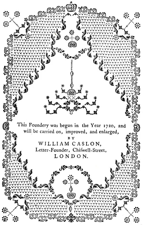
And it all happened around the eastern fringes of the City of London. “The Caslon family tomb stands alone today in front of St Luke’s Old St, just yards from where William Caslon started his first letter foundry in Helmet Row in 1727 and, with pleasing consistency, it is lettered in Caslon type.”

“It was in the creation of his distinctly English version of Roman letters and italics, derived from the Dutch typefaces that were most commonly used in London at that time, which was the decisive factor in the establishment of Caslon’s reputation.

Caslon’s first type Specimen of 1734 exemplifies a confidence and clarity of design which has become so familiar that it is difficult to appreciate in retrospect. The Specimen offered a range of styles and sizes of type with an unprecedented authority and a distinctive personality which is immediately recognisable. As a consequence of the legibility and grace of Caslon’s work, his became the default choice of typeface for books and all kinds of publications in the English-speaking world for the next two centuries.”

The Caslon type crossed the Atlantic and became very influential in the just-about-to-be born United States of America when John Dunlap of Philadelphia set the type for the first printing of 200 copies of the Declaration of Independence, working into the night of 4 July 1776. It’s a source of pleasure to those of us of a typographic bent that one of the Committee of Five final drafting committee was Benjamin Franklin, statesman, polymath and printer, later to have a typeface named after him. Whether Franklin instructed Dunlap to use Caslon’s typeface is not known.

Caslon’s type has remained extraordinarily popular in the USA, probably more so than in the country of its birth. It is still used by the New Yorker, both for the paper copies and in the online version. There are those, however, who dislike it: one such being the American type historian Bruce Rogers, who thought it overused in England, which he described in the early 20th century as a “Caslon-ridden country”. This may well have been a reaction to the insistence of George Bernard Shaw that all his books be printed in it.

Caslon himself died in 1767 and is buried in St Luke’s church in Old Street, London. This is now deconsecrated and used for rehearsals and performances by the London Symphony Orchestra. One hopes that, as they pluck and blow through their latest repertoire, the musicians think occasionally of the important history of the man in the tomb outside.

Caslon_family_grave,_St_Luke's

Pic: Wikimedia Commons

Advertisement

Smart swash cap for airship design

R100 cover loresR100 inside lores

I have already written about the brochure shown above on my Dambusters blog. However, I thought I would draw attention to it again here, and also write something more about the design and typography.
The brochure (from the Ray Hepner collection) was produced to promote the R100 airship, one of the earlier projects with which the engineer Barnes Wallis was associated. His name of course well known as the person who designed the so-called bouncing bomb during the Second World War, but he had a long career both before and after this period. Back in the 1920s, Wallis headed the design team which built the R100 airship. This was a privately designed and built rigid British airship made as part of the Imperial Airship Scheme, a competition to develop a commercial airship service for use on in the British Empire.
The brochure would seem to have been designed about the time of R100’s first flight. The title page has an interesting design, which involved some hand mortising of metal type. The title itself is set in a large size of Garamond Italic and Roman, with the full point hand cut so that it fits exactly above the tail of the curve of the swash capital R. The rest is set in smaller sizes of Garamond. The upper and lower case in the “Designed and constructed” line was obviously letterspaced in order to drive it out to the same width as the line below. I’m not sure the purists would approve of that.
The cover is completely different: a peculiar sans serif with a short tailed R for the title, and an even odder script for the “Howden Yorkshire” line appear below a rather nice illustration of the airship.
R100 first flew in December 1929. It made a series of trial flights and a successful return crossing of the Atlantic in July–August 1930, but following the crash of its rival, R101, in October 1930 the Imperial Airship Scheme was terminated and it was broken up for scrap. R100, which it could be argued had the more innovative design, was thus terminated even though it had a more successful life.

[Thanks to Ray Hepner]

Pointless Penguins

Penguin Stamp

A guilty pleasure of mine is watching Pointless on BBC afternoon TV. As I usually also use the time to preparing the family dinner, I am able to justify it as not being entirely wasted. Like most addicts of the programme, I get further pleasure from thinking of a pointless answer in the final round, and speculating whether I would have been able to do the same if I was actually on air.
So I was chuffed when, on a recent episode, one of the questions was ‘Name any of the authors whose titles were in the first ten books published by Penguin’. I was able to think of two or three straightaway, including Penguin No. 1, Ariel by Andre Maurois, and Poet’s Pub by Eric Linklater. A virtual jackpot for me!
The Penguin story started with Allen Lane, the proprietor and publisher of the Bodley Head who wanted to make quality books available to all at low prices. He produced a series of ten paperback books, all costing sixpence (the same price as a packet of cigarettes) and colour-coded: orange for fiction, blue for biography and green for crime. A junior member of staff at Bodley Head was Edward Young who, because he could draw, was sent off to London Zoo to sketch some real life penguins. From these, he designed the artwork for the company’s first logo. Young also specified the typography for the printers.
The first Penguins are now rightly seen as being an important milestone in graphic design, and Young was recognised by being one of the ten designers featured on a series of British postage stamps in 2009. Young told the story himself in a tape recording held in the archives at the University of Reading’s Department of Typography and Graphic Communication:

I never had any training at all. It all started because when I was still in publishing I used to draw quite a lot. My present wife who was then my very young girlfriend urged me to go to an art school so I went to Hornsey School of Art. I couldn’t draw very well, but what they had there was a typographical department where you could go and set up type and I found this absolutely fascinating. So that’s where it all started from. I started getting used to different typefaces. I was working at the time at the Bodley Head. Bodley Head was running into a lot of financial difficulties so they couldn’t afford to have experts to do those things. I was really an office boy and because I got interested in typography I asked if I could do one or two of their advertisements. A very nice chap called Lindsay Drummond did the advertising in a very amateur way said yes, lovely, so I tried a few. Then the chap who had been doing book production got fired so I got to do all the book production as well. Suddenly I was into typography in a big way.

When the war started, Young joined the Royal Navy Volunteer Reserve and this is how he became a childhood hero of mine, because after the war he wrote the classic wartime story One of our Submarines.

361px-One_of_our_Submarines

This is his account of his time in the navy, where he volunteered for submarine service and became only the second RNVR officer to become the commanding officer of a submarine, HMS Storm, which was commissioned from Cammell Laird on Merseyside in late 1943. In 1944, they travelled out to the Far East, where they were stationed first in Trincomalee, Ceylon and later in Freemantle, Australia. They carried out a series of patrols over the next year, and got back to the UK in April 1945.

Good Evening A1983_73ex5

Young took a portable typewriter with him during his service and most nights he would type up a single copy newsletter, which he called Good Evening. This contained a briefing as to what had happened during the day, war news gleaned from signals received, ‘pin-ups’ cut from magazine, and contributions from other members of the crew. It was passed hand to hand amongst the crew, and read avidly. Young managed to retrieve most of the copies after they had been circulated, and used them extensively when writing his book. They are now in the archives of the Royal Navy Submarine Museum in Gosport.
On returning from the war, Young went back into publishing and in 1946 became one of the first directors of the new firm set up by Rupert Hart-Davis, along with David Garnett. According to Hart-Davis’s biographer, Philip Ziegler, Young was a man whose charm and glamour meant that ‘all the girls in the office were half in love with him’. But he was also a ‘book designer of outstanding merit’ who ‘could turn his hand to any facet of publishing other than finance’. (Philip Ziegler, Rupert Hart-Davis, Pimlico 2005, pp.132-3).
Young had actually left the Hart-Davis firm by the time his book was finished, but it was published by them in hardback in 1952, and became a big seller. In 1954, Allen Lane decided to honour his former employee by choosing his book to be the 1000th Penguin, and it was duly published by the firm with a special laurel wreath incorporated into the front cover. Penguin had largely stayed away from publishing war memoirs – a lucrative market in the 1940s and 50s – but were rewarded by very good sales for this fine book, still seen by many as a classic of the genre.
A fascinating postscript to this period was the appearance on the cover of the famous Victor comic of one of the actions in which the crew of HMS Storm took part. This was regular reading in our family, as in many others of the time.

Victor 280364 copy

Young died in 2003 at the age of 89, but his book remains available as an ebook from Pen and Sword.  Real nostalgia buffs will of course prefer to get a second hand copy of the Penguin edition, which you can readily find online.

More information on Edward Young’s Wikipedia page.

Down the Road Apiece

Stones back lores

After many years without a way of playing vinyl discs, I have recently bought myself a new hi-fi system which includes a turntable. So I dug out a box of old LPs, which was then pounced on by my 22 year old son. “I didn’t know you had all this stuff,” he said, in an approving manner, as he put Dark Side of the Moon onto the turntable. He then showed his ignorance of the technology by failing to select the correct speed, so the disc began playing at 45rpm. Meaningless songs in very high voices indeed.
The record I looked for straightaway was one I used to play all the time at school, The Rolling Stones No.2 album. I was under the impression that for copyright reasons this had never been made available on CD or via download, but I see from Wikipedia that the dispute was actually resolved in 2010. Which shows how up to date I am.
The album opens with a stonking version of ‘Everybody Needs Somebody to Love’. “That’s the song from The Blues Brothers,” said my son. It may be, but it’s actually by Solomon Burke, famous in his later life for doing a great session on a Jools Holland New Year Hootenany while sitting down. In fact, nine out of the twelve songs are R&B covers, and the performances remind us what a great blues band the Stones were in their early days.
When I bought this album, aged 15, I didn’t know a lot about print, or the production of artwork. But I can now see that the sleeve notes and track listings on the reverse seem to have been largely produced on an IBM Electric Executive typewriter with variable character widths, probably one like this:

d-exec
Note the two space bars – one moved the carriage forward by two units, the other by three. To get a single unit space, you had to depress the two unit bar and then backspace by one unit. I remember seeing these still in use in the 1970s, although by then they were largely being superseded by IBM ‘golf ball’ typewriters, which had fixed character widths. An Executive typewriter of this kind was used in the production of Private Eye in this period, although theirs had the more usual seriffed ‘typestyle’, as the IBM literature called it. Here is a list of the typestyles available:

IBM Typestyles lores

Pic: Munk.org

I am not able to track down samples of the actual typestyle used. It does look a little like the later Letter Gothic, but of course that was a fixed space type.
It’s not only the typography which is of note on this album. The two columns of text at the top right of the sleeve, written by Andrew Loog Oldham, is a great piece of hip writing (‘Cast deep in your pockets for loot to buy this disc of groovies and fancy words’). The text namechecks twice the almost forgotten man of Stones management, showbiz agent Eric Easton who (namedrop, namedrop) became a friend of my parents when his daughter went to school with my sisters. Here he is, Mr Easton as we always called him, photographed with Mick Jagger in a picture I found on the Gary Rocks blog.

img_4905

When we knew him, he looked like an archetypal agent with his big Jaguar and cigars. He was eventually dropped by the Stones, and replaced by Allan Klein. He later had a toyshop in Uxbridge, and I did some deliveries for him one Christmas time. But that is another story.

Adrian Frutiger: Obituary for the Guardian

1427

Obituary for Adrian Frutiger, published in the Guardian, 5 October 2015.

Frutiger attributed some of his skills to the genes he inherited from his ancestors among the farming communities of the Bernese Oberland in Switzerland, where there is a craft tradition of making paper cutouts and silhouettes. After days spent tending livestock or cutting hay, men and women in the region would show remarkable dexterity, using scissors to cut pieces of thin black paper into depictions of scenes from their daily lives. Many of Frutiger’s designs were constructed using large paper proofs that he would then trim with scissors and a knife, shaving a millimetre here and there until he had reached the result he wanted. The letters in all his work show this attention to detail and are always open and clear, allowing the message they convey to be understood without impediment. “Type is the clothing a word wears, so it must be subordinate to the content,” he said.
Read more.

Hermann Zapf: Obituary for the Guardian

s14b2

Obituary for Hermann Zapf, published in the Guardian, 1 July 2015.

In 1963 Hermann Zapf walked into an American design school, snapped a piece of chalk in half and, with its side edge, drew a perfect lowercase g on the blackboard. He went on to give an inspired lecture on the different angles that a calligrapher uses when holding a pen, and how strokes differ between calligraphy and typography – all illustrated, not with slides, but with impeccably executed chalk drawings.
Read more.