Happy Christmas, 41 years ago

Old guys and nostalgia freaks like me love blogs like The Radical History of Hackney. A year or two ago, I donated an almost complete run of issues of Hackney People’s Press to John, the blog’s compiler, in the sure knowledge that he would give them a good home and find them useful for reference.
John has obviously been working through them, and has just posted a summary of the issues we produced in 1976. The first issue of HPP for the year didn’t get published until May, when I got together with one or two people in a hopeful attempt to get it back and running again after an absence of several months. I’m glad to say that a few people came forward, and throughout that long hot summer we managed a few more editions, culminating in a November/December Christmas special. One of the new people involved was called Tony, and it is him that is posing in the Father Christmas outfit on the cover shown here.
One page in the Christmas issue was a spoof Hackney Gazette, which we subjected to biting satire based on its normal diet of gruesome court cases.

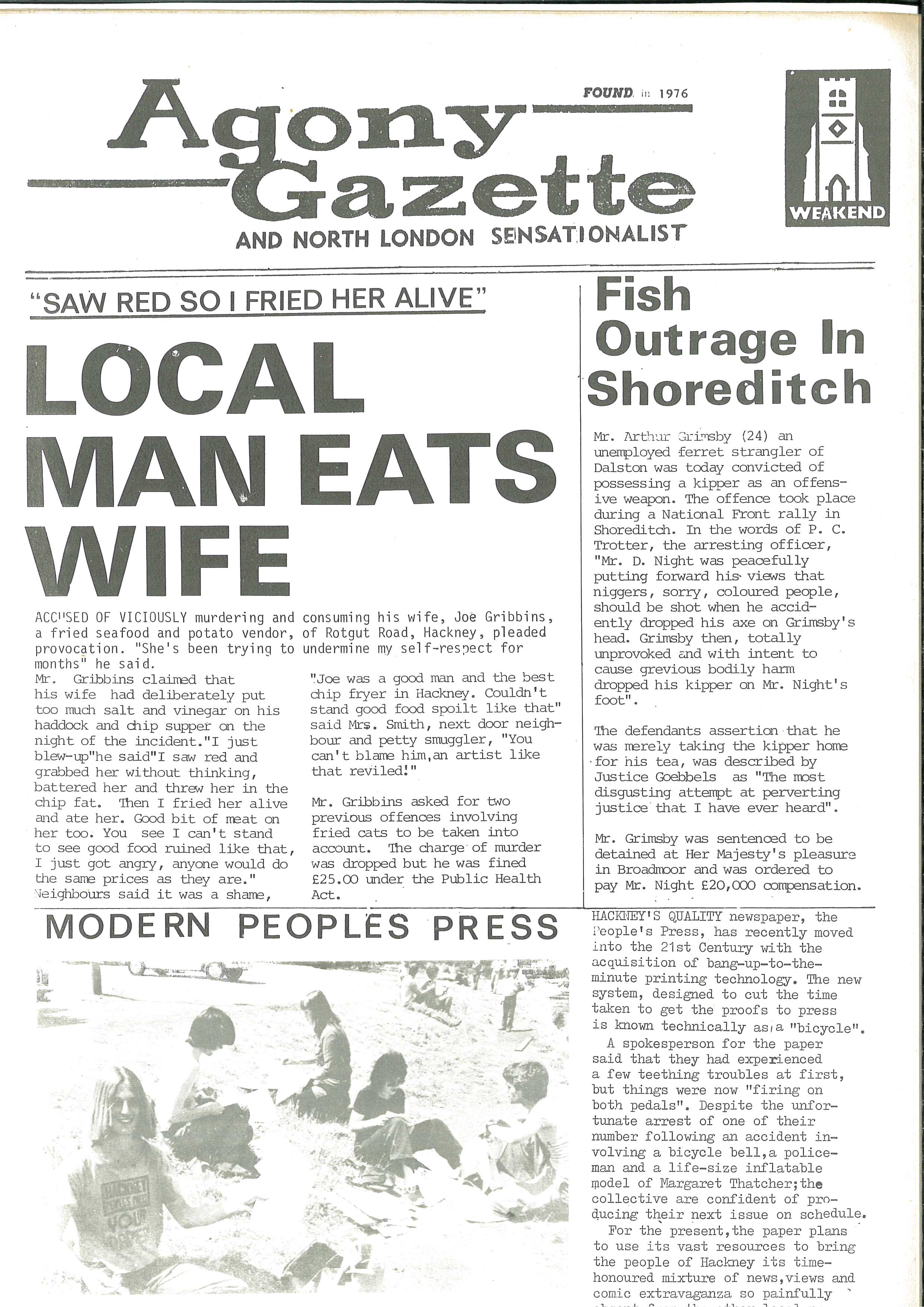
At the bottom of this page is a happy picture of HPP workers sitting on the ground at that summer’s Hackney Marsh Fun Festival folding copies ready for sale. Tony is the guy at the front, holding up a copy for the camera. Behind him facing right is a considerably thinner and hairier figure: me at the age of 26.
Forty-one years ago, eh? A lot has changed since then, but I’m still here, and at this festive season I wish you a very happy Christmas.

Advertisement

Respect and respectability

I am reading and much enjoying Lynsey Hanley’s book, Respectable, about social class in Britain. Like her, I read Richard Hoggart’s The Uses of Literacy at quite a young age although with my solidly middle class background I did not feel, as does Hanley, that Hoggart could have been writing about my own childhood.

However, it’s not the content that I want to write about here. Rather, it’s the book production standards which display a slackness one would not have expected from a firm like Penguin. Here is a spread:

Just how did the quoted matter on the left hand page slip through the proofing process? You would think that anyone with half a book production brain would spot that it is set in Times – especially so when there is quoted matter on the right hand page, set correctly in Bembo. In case you think I’m being unnecessary picky, there are actually several instances of this in the book – I’ve chosen to show the one where there are two pieces of quoted matter on a double page spread.

The typography in the book is actually very classical in style and quite nice, and I’m glad to see that Penguin still provides the typeface name on the title page verso. Quite why the book is set in a typesize of 11.76/14.76pt is, however, a bit of a mystery. How would you happen on such an odd size?

Mass book production has always depended on fast turnaround but you do expect good practise from the firm whose high standards were set by one of the greatest 20th century typographers. Hans (‘Half-Point’) Schmoller would not have been amused.