A guilty pleasure of mine is watching Pointless on BBC afternoon TV. As I usually also use the time to preparing the family dinner, I am able to justify it as not being entirely wasted. Like most addicts of the programme, I get further pleasure from thinking of a pointless answer in the final round, and speculating whether I would have been able to do the same if I was actually on air.
So I was chuffed when, on a recent episode, one of the questions was ‘Name any of the authors whose titles were in the first ten books published by Penguin’. I was able to think of two or three straightaway, including Penguin No. 1, Ariel by Andre Maurois, and Poet’s Pub by Eric Linklater. A virtual jackpot for me!
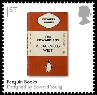
The Penguin story started with Allen Lane, the proprietor and publisher of the Bodley Head who wanted to make quality books available to all at low prices. He produced a series of ten paperback books, all costing sixpence (the same price as a packet of cigarettes) and colour-coded: orange for fiction, blue for biography and green for crime. A junior member of staff at Bodley Head was Edward Young who, because he could draw, was sent off to London Zoo to sketch some real life penguins. From these, he designed the artwork for the company’s first logo. Young also specified the typography for the printers.
The first Penguins are now rightly seen as being an important milestone in graphic design, and Young was recognised by being one of the ten designers featured on a series of British postage stamps in 2009. Young told the story himself in a tape recording held in the archives at the University of Reading’s Department of Typography and Graphic Communication:
I never had any training at all. It all started because when I was still in publishing I used to draw quite a lot. My present wife who was then my very young girlfriend urged me to go to an art school so I went to Hornsey School of Art. I couldn’t draw very well, but what they had there was a typographical department where you could go and set up type and I found this absolutely fascinating. So that’s where it all started from. I started getting used to different typefaces. I was working at the time at the Bodley Head. Bodley Head was running into a lot of financial difficulties so they couldn’t afford to have experts to do those things. I was really an office boy and because I got interested in typography I asked if I could do one or two of their advertisements. A very nice chap called Lindsay Drummond did the advertising in a very amateur way said yes, lovely, so I tried a few. Then the chap who had been doing book production got fired so I got to do all the book production as well. Suddenly I was into typography in a big way.
When the war started, Young joined the Royal Navy Volunteer Reserve and this is how he became a childhood hero of mine, because after the war he wrote the classic wartime story One of our Submarines.
This is his account of his time in the navy, where he volunteered for submarine service and became only the second RNVR officer to become the commanding officer of a submarine, HMS Storm, which was commissioned from Cammell Laird on Merseyside in late 1943. In 1944, they travelled out to the Far East, where they were stationed first in Trincomalee, Ceylon and later in Freemantle, Australia. They carried out a series of patrols over the next year, and got back to the UK in April 1945.
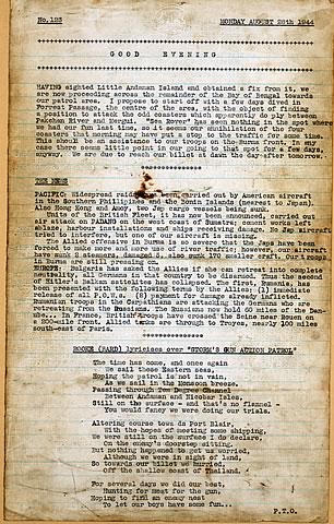
Young took a portable typewriter with him during his service and most nights he would type up a single copy newsletter, which he called Good Evening. This contained a briefing as to what had happened during the day, war news gleaned from signals received, ‘pin-ups’ cut from magazine, and contributions from other members of the crew. It was passed hand to hand amongst the crew, and read avidly. Young managed to retrieve most of the copies after they had been circulated, and used them extensively when writing his book. They are now in the archives of the Royal Navy Submarine Museum in Gosport.
On returning from the war, Young went back into publishing and in 1946 became one of the first directors of the new firm set up by Rupert Hart-Davis, along with David Garnett. According to Hart-Davis’s biographer, Philip Ziegler, Young was a man whose charm and glamour meant that ‘all the girls in the office were half in love with him’. But he was also a ‘book designer of outstanding merit’ who ‘could turn his hand to any facet of publishing other than finance’. (Philip Ziegler, Rupert Hart-Davis, Pimlico 2005, pp.132-3).
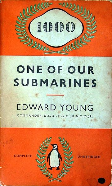
Young had actually left the Hart-Davis firm by the time his book was finished, but it was published by them in hardback in 1952, and became a big seller. In 1954, Allen Lane decided to honour his former employee by choosing his book to be the 1000th Penguin, and it was duly published by the firm with a special laurel wreath incorporated into the front cover. Penguin had largely stayed away from publishing war memoirs – a lucrative market in the 1940s and 50s – but were rewarded by very good sales for this fine book, still seen by many as a classic of the genre.
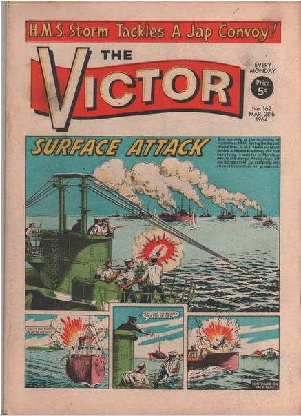
A fascinating postscript to this period was the appearance on the cover of the famous Victor comic of one of the actions in which the crew of HMS Storm took part. This was regular reading in our family, as in many others of the time.
Young died in 2003 at the age of 89, but his book remains available as an ebook from Pen and Sword. Real nostalgia buffs will of course prefer to get a second hand copy of the Penguin edition, which you can readily find online.
More information on Edward Young’s Wikipedia page.