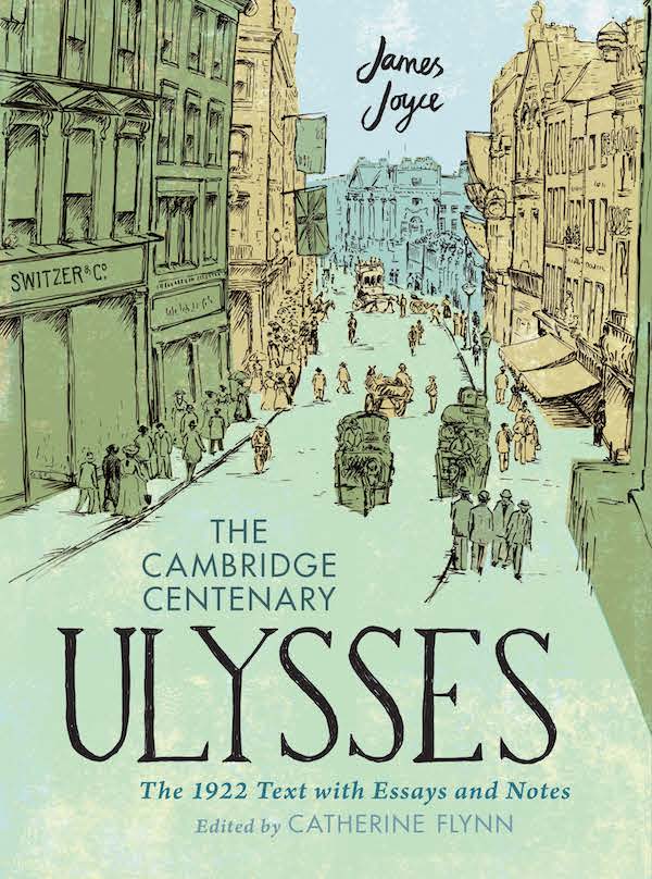
I was very pleased to be given a copy of the new Cambridge edition of Ulysses as a Christmas present. In a handsome large format and weighing in at over 4kg, it’s an imposing volume. I’m a sucker for this kind of volume – a book about the making of a book: a facsimile of the original edition, accompanied by notes and other bibliographical references.
However, for all its grand design, I believe that the book’s overall effect is let down by some poor design decisions and use of inferior quality paper.

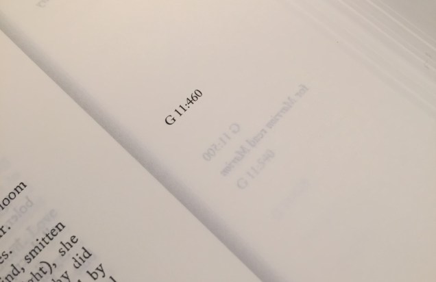
You can see the basic design from the spread shown above. The novel’s facsimile is run in spreads on each side of the gutter, and the text of the annotations is in two, or sometimes three, columns underneath. It’s a neat touch to align the annotations with the left hand margin of the recto page of the facsimile. The numbers beginning with G shown in the left and right foredge margins refer to the line numbers of what Joyce scholars call the Gabler edition of 1986, widely regarded as definitive. These margins are also used for Joyce’s own errata notes.
However, you can see immediately the problem with the back margin. It is so small that the type is running into the gutter, and therefore difficult to read. This is a spread from roughly the middle of the volume, but with such a heavy book the effect is even worse on spreads near the beginning and end. In the meantime, the foredge margin is so generous that it has an acre of empty space on almost every page.
 A quick glance at these shows terrible showthrough on every page, as can be seen above. Showthrough is a real problem throughout as can be seen again in the image below, which shows what happens on commentary section pages which have illustrations or maps.

Because the commentary sections follow the same margin arrangement as the facsimile, the back margin is far too small, making it difficult to follow the text. Again, this problem is exacerbated in the sections nearer the front or back of the volume, as can be seen below:

It would have only required a small adjustment of the back margins to improve the design and resolve the problem of the text disappearing into the gutter. I cannot be sure but it may well be that the problem may have arisen because of a decision to use the same back margin as the 1922 text, with its much narrower page width. An extra 5mm back margin could easily be taken from the generous foredge with no effect on the overall line length.
My final production point of disagreement may be linked. This concerns the difficulty of actually reading the book. When it is placed flat on a table, my copy only remains open when reading between pages 220 and 740. If I don’t hold the edge down when reading pages before or after this range, the book closes with a thump. This is caused because the book block is bound too tightly to the boards for its weight and size.
It’s sad that these design and production defects spoil the overall effect of what is otherwise a handsome and useful contribution to the chequered publishing history of what I’m told is a literary masterpiece. (See this article by Stacey Herbert for the book’s production history.) I read most of Ulysses in the summer of 1969, when the Penguin edition was published, but I confess I never got to the end. I am looking forward to finding the time to tackle it again sometime soon. I’m ready, my kitchen table is ready, and I will do my best to complete the project. Wish me luck.
Read more about this edition in this Irish Times article by its editor Catherine Flynn.