After many years without a way of playing vinyl discs, I have recently bought myself a new hi-fi system which includes a turntable. So I dug out a box of old LPs, which was then pounced on by my 22 year old son. “I didn’t know you had all this stuff,” he said, in an approving manner, as he put Dark Side of the Moon onto the turntable. He then showed his ignorance of the technology by failing to select the correct speed, so the disc began playing at 45rpm. Meaningless songs in very high voices indeed.
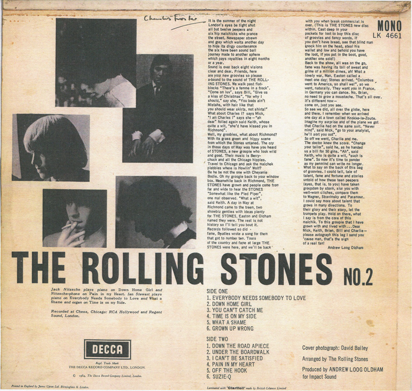
The record I looked for straightaway was one I used to play all the time at school, The Rolling Stones No.2 album. I was under the impression that for copyright reasons this had never been made available on CD or via download, but I see from Wikipedia that the dispute was actually resolved in 2010. Which shows how up to date I am.
The album opens with a stonking version of ‘Everybody Needs Somebody to Love’. “That’s the song from The Blues Brothers,” said my son. It may be, but it’s actually by Solomon Burke, famous in his later life for doing a great session on a Jools Holland New Year Hootenany while sitting down. In fact, nine out of the twelve songs are R&B covers, and the performances remind us what a great blues band the Stones were in their early days.
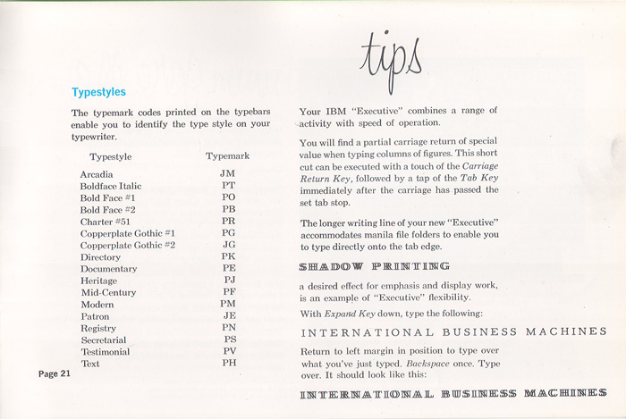
When I bought this album, aged 15, I didn’t know a lot about print, or the production of artwork. But I can now see that the sleeve notes and track listings on the reverse seem to have been largely produced on an IBM Electric Executive typewriter with variable character widths, probably one like this:

Note the two space bars – one moved the carriage forward by two units, the other by three. To get a single unit space, you had to depress the two unit bar and then backspace by one unit. I remember seeing these still in use in the 1970s, although by then they were largely being superseded by IBM ‘golf ball’ typewriters, which had fixed character widths. An Executive typewriter of this kind was used in the production of Private Eye in this period, although theirs had the more usual seriffed ‘typestyle’, as the IBM literature called it. Here is a list of the typestyles available:
Pic: Munk.org
I am not able to track down samples of the actual typestyle used. It does look a little like the later Letter Gothic, but of course that was a fixed space type.
It’s not only the typography which is of note on this album. The two columns of text at the top right of the sleeve, written by Andrew Loog Oldham, is a great piece of hip writing (‘Cast deep in your pockets for loot to buy this disc of groovies and fancy words’). The text namechecks twice the almost forgotten man of Stones management, showbiz agent Eric Easton who (namedrop, namedrop) became a friend of my parents when his daughter went to school with my sisters. Here he is, Mr Easton as we always called him, photographed with Mick Jagger in a picture I found on the Gary Rocks blog.
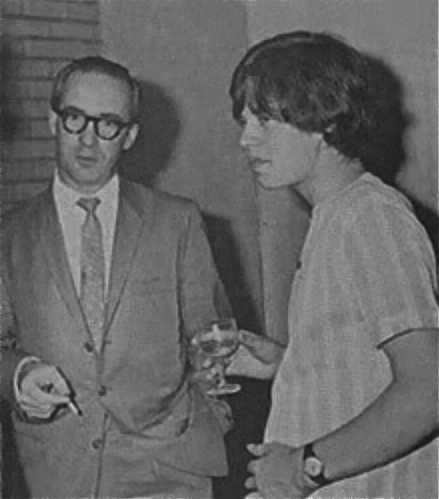
When we knew him, he looked like an archetypal agent with his big Jaguar and cigars. He was eventually dropped by the Stones, and replaced by Allan Klein. He later had a toyshop in Uxbridge, and I did some deliveries for him one Christmas time. But that is another story.
