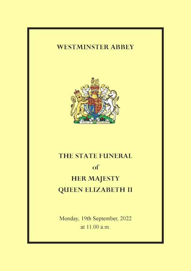
As I watched on TV the congregation leaving Westminster Abbey after the Queen’s funeral last week I noticed that most were carrying a copy of the printed Order of Service. Such is the speed of modern communications, I was able to find a downloadable PDF on the Gov.uk website within a minute or two. Well done those royal flunkeys responsible.
The use of Perpetua Bold on the cover caught my eye, although the Times Roman setting beneath for the dateline grated. Inside I was pleased to see that the Perpetua theme was carried on throughout, with a nice use of spaced caps, drop caps and italic.

Perpetua was in fact used for the last great State occasion in Westminster Abbey, the Coronation of Queen Elizabeth II. I remembered this because I have a copy of the special edition of the Monotype Recorder celebrating the life and work of Stanley Morison, and I recalled that it showed the covers of the Orders of Service for the Coronations of both George VI and Elizabeth II, as seen below:

(I have taken the above illustration from the collection of PDFs of the Monotype Recorder on the wonderful Metaltype website.)
Sadly, I couldn’t find the full Coronation Order of Service online, although I did come across a couple of images. One, on the Parliament website, shows a handsome double page spread:

The second is just a snippet of one page, on a University of Nottingham blog:
There are a couple of things about this second image which makes it different from the Parliament version. The text is in black only and the section heading is in u/lc rather than caps. The Nottingham blog from which I sourced the image says that it is from the “Music with the Form and Order of Service”, so perhaps this was a different publication for use by the choirs and musicians.
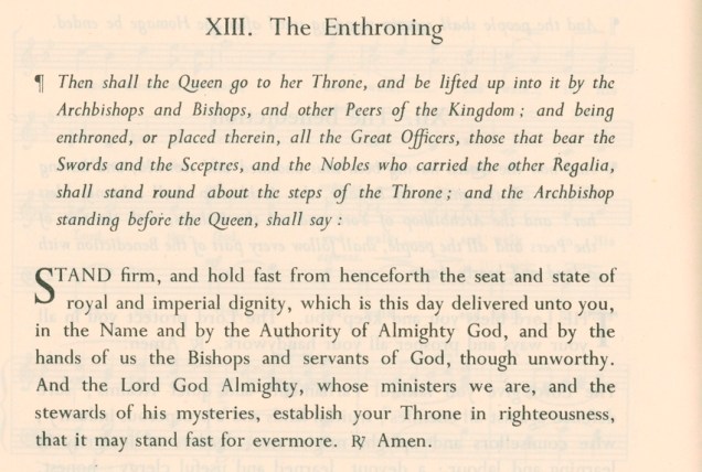
But what is the same about both is that they are typeset in Perpetua, with a lovely long-tailed Q which I imagine was specially cut. I’m guessing that it was set in Monotype, but I’m not enough of an expert to be certain. The 2022 digital version is a faithful reproduction.
Perpetua is a lovely typeface, and looks splendid when used for this kind of setting. However, in my view, it never really works in books – there is something about its idiosyncrasies which makes continuous reading difficult.
We’ll see next year whether it’s used for Charles III’s Coronation. It would be nice if it is. But I wonder if he might issue one of his ‘black spider’ decrees that some other type be chosen? On a recent visit to Poundbury in Dorset, with its ‘feudal Disneyland’ architecture, I didn’t spot any evidence of an interest in typography or lettering.