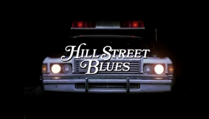
Near the top of my personal list of typefaces never to be used is Bookman. (Also present: Souvenir, University Roman, Eurostile.) So it was with some pain that most weeks throughout the 1980s I sat through the opening credits in order to watch one of the best TV cop shows of all time. I refer, of course, to Hill Street Blues, whose creator Steven Bochco has recently died.
Great TV it might have been (as indeed was its successor, NYPD Blue) but I only just forgave the producers the use of (ugh) Bookman Bold Italic, with extra swashes, for the title sequences. Most episodes started with the day’s briefing, given by the desk sergeant, which always ended: ‘Let’s be careful out there.’ A good motto for life.
