Two weeks into the Guardian’s redesign as a tabloid, it’s interesting to see how the masthead has evolved. Here are the mastheads from the first five days:
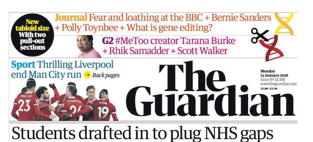

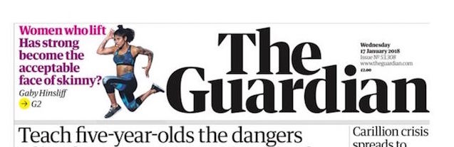
Safe to say, there is a lot going on in all of them.
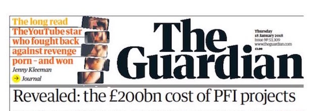
But it seems that now it has been decided to change things a bit – mainly by introducing a faint blue tint into the background. And on both Monday and Tuesday, the number of other items in the box was reduced considerably. Here is yesterday’s masthead (6 February):

The words The Guardian have been lifted slightly to leave space between them and the four fine rules which separate the masthead from the splash headline below. The typography is restricted to two shades of blue and black.
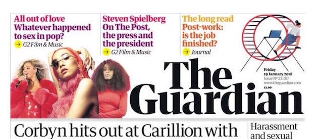
However, today (7 February) – bang! All the clutter is back, and the colour palette for the typography has been wildly expanded.

It’s a design which is obviously evolving.
I’m still not sold on the type used in the masthead itself. It was described on the first day as being specially drawn for the purpose. To me, it looks too much like that ghastly 70s kitsch typeface, ITC Tiffany Heavy:
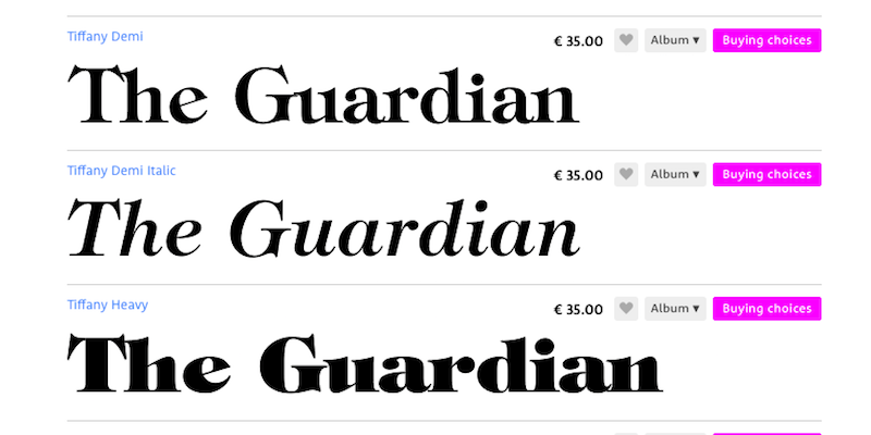
I know the individual letterforms aren’t much the same, but it is the overall effect which immediately reminded me. Each to their own, I suppose.
