Nickel’s beautiful book

Beautiful-Idiots-Front-Cover-426x572

I must have come across Rob Baker’s fantastic blog Another Nickel in the Machine six or seven years ago, although it first appeared online in 2007.
I suppose that the blog is best described as a series of stories about places and events in London. But that doesn’t begin to take account of the range of personalities, genres, time periods and sheer battiness covered. 
Just look at some of the people who appear in its entries: Mary Quant, Benny Hill, Guy Burgess, Charlie Chaplin, Christine Keeler, William Joyce, Ronnie Kray, Keith Moon. For each of these names there is a long, well-researched and quite captivating story about a particular incident in their life, pointing out connections that must have seemed bizarre at the time and almost unbelievable now. For instance, how on earth did the writer Colin Wilson (author of dozens of books in the 1950s and 60s but almost forgotten now) manage to inveigle himself into a film screening with Marilyn Monroe (and Laurence Olivier)? The answer to this is on the website, but even better for those of us who still like to access our information on pieces of paper gathered together inside a cover (it’s called a ‘book’, Jennifer — ask your grannie), it has now been published in hard copy form.
Each essay (it seems appropriate to give the articles a grown-up name) has been revised and often extended for this quite wonderful publication, which is called Beautiful Idiots and Brilliant Lunatics. £14.99 will buy you a copy from your local bookstore, or you can source it online from the usual emporia.

Highways revisited

Calvert

The name of Margaret Calvert, who received the OBE in the recent honours list, may not be that widely known amongst the British general public, but her work is undoubtedly more widely seen than any other graphic designer in the country. In the late 1950s Calvert, along with her colleague Jock Kinneir, began work on the new road signage system for the UK. The pair went on to be involved in many more public signing projects, for airports, railways, and hospitals.
Kinneir was born in 1917 and studied at Chelsea School of Art in the 1930s. In 1956 he set up a London design practice, teaching part-time at Chelsea. Margaret Calvert had been one of his students and after graduating joined him in his practice. Kinneir died in 1994.

Calvert schoolschool old signSchool sign Ire 1159 lores

Kinneir and Calvert’s designs for British roads were not only practical, they exhibited a warmth and humanity lacking in signage in some other countries. The ‘Transport’ sans serif font they designed has a ‘soft’ feel and their pictograms were sensitively drawn. A lot of the original work is still in use today and, indeed, the Department of Transport was able to turn to the pair’s artwork and layout instructions when it digitised the signs about 15 years ago.
Calvert drew some of the artwork herself, including the ‘children’ warning sign shown above. It is instructive to compare it with the British sign it superseded (whose young boy had what she called a ‘grammar school’ look) and the overly fussy sign still in use in Ireland. Her removal of all unnecessary detail is a good example of how the best public information designers produce material which allows the optimum number of users to use their cognitive capacity to the full.
Kinneir and Calvert’s original work was done at a time when, in the words of author Robin Kinross, there was an ‘official will to modernise the public infrastructure’. It resulted in the work becoming a rare model of the role that design can play in public life. Although the Department is still using the basic design, it has a regrettable tendency these days to add unnecessary extra clutter (such as brown panels for tourist information).

More information about Margaret Calvert here, and on her Wikipedia page.

At the sign of the deer

A good entry for the most baffling sign of 2016 has recently appeared in Dublin’s Phoenix Park. I have gone there most days in the last five years to walk my dog and am well accustomed to keeping her clear of the park’s long-established herd of fallow deer. She now looks over at them with an air of slight bafflement, but is no longer inclined to chase them.
Over these five years, I have noticed a definite increase in the numbers of people, mainly tourists, who bring food for the herd. Although this is banned by the park’s by-laws, the rangers seem to have given up trying to enforce it. Two years ago, notices were erected all round the park warning users not to approach or feed the deer, but these have been blithely ignored. The signs are printed in English and Irish – if they were in Spanish or Japanese they might have more effect.
An example of the bilingual sign can be seen on the left below. But last week, another sign appeared (see right):

Deer sign2

Deer sign1

What on earth does this mean? I guess it’s a warning that a deer might get up on its back legs and attack you. But would it do that because you are trying to feed it? Or is the park now full of dangerous deer who might chase you down? Some explanation required, I think.

Pointless Penguins

Penguin Stamp

A guilty pleasure of mine is watching Pointless on BBC afternoon TV. As I usually also use the time to preparing the family dinner, I am able to justify it as not being entirely wasted. Like most addicts of the programme, I get further pleasure from thinking of a pointless answer in the final round, and speculating whether I would have been able to do the same if I was actually on air.
So I was chuffed when, on a recent episode, one of the questions was ‘Name any of the authors whose titles were in the first ten books published by Penguin’. I was able to think of two or three straightaway, including Penguin No. 1, Ariel by Andre Maurois, and Poet’s Pub by Eric Linklater. A virtual jackpot for me!
The Penguin story started with Allen Lane, the proprietor and publisher of the Bodley Head who wanted to make quality books available to all at low prices. He produced a series of ten paperback books, all costing sixpence (the same price as a packet of cigarettes) and colour-coded: orange for fiction, blue for biography and green for crime. A junior member of staff at Bodley Head was Edward Young who, because he could draw, was sent off to London Zoo to sketch some real life penguins. From these, he designed the artwork for the company’s first logo. Young also specified the typography for the printers.
The first Penguins are now rightly seen as being an important milestone in graphic design, and Young was recognised by being one of the ten designers featured on a series of British postage stamps in 2009. Young told the story himself in a tape recording held in the archives at the University of Reading’s Department of Typography and Graphic Communication:

I never had any training at all. It all started because when I was still in publishing I used to draw quite a lot. My present wife who was then my very young girlfriend urged me to go to an art school so I went to Hornsey School of Art. I couldn’t draw very well, but what they had there was a typographical department where you could go and set up type and I found this absolutely fascinating. So that’s where it all started from. I started getting used to different typefaces. I was working at the time at the Bodley Head. Bodley Head was running into a lot of financial difficulties so they couldn’t afford to have experts to do those things. I was really an office boy and because I got interested in typography I asked if I could do one or two of their advertisements. A very nice chap called Lindsay Drummond did the advertising in a very amateur way said yes, lovely, so I tried a few. Then the chap who had been doing book production got fired so I got to do all the book production as well. Suddenly I was into typography in a big way.

When the war started, Young joined the Royal Navy Volunteer Reserve and this is how he became a childhood hero of mine, because after the war he wrote the classic wartime story One of our Submarines.

361px-One_of_our_Submarines

This is his account of his time in the navy, where he volunteered for submarine service and became only the second RNVR officer to become the commanding officer of a submarine, HMS Storm, which was commissioned from Cammell Laird on Merseyside in late 1943. In 1944, they travelled out to the Far East, where they were stationed first in Trincomalee, Ceylon and later in Freemantle, Australia. They carried out a series of patrols over the next year, and got back to the UK in April 1945.

Good Evening A1983_73ex5

Young took a portable typewriter with him during his service and most nights he would type up a single copy newsletter, which he called Good Evening. This contained a briefing as to what had happened during the day, war news gleaned from signals received, ‘pin-ups’ cut from magazine, and contributions from other members of the crew. It was passed hand to hand amongst the crew, and read avidly. Young managed to retrieve most of the copies after they had been circulated, and used them extensively when writing his book. They are now in the archives of the Royal Navy Submarine Museum in Gosport.
On returning from the war, Young went back into publishing and in 1946 became one of the first directors of the new firm set up by Rupert Hart-Davis, along with David Garnett. According to Hart-Davis’s biographer, Philip Ziegler, Young was a man whose charm and glamour meant that ‘all the girls in the office were half in love with him’. But he was also a ‘book designer of outstanding merit’ who ‘could turn his hand to any facet of publishing other than finance’. (Philip Ziegler, Rupert Hart-Davis, Pimlico 2005, pp.132-3).
Young had actually left the Hart-Davis firm by the time his book was finished, but it was published by them in hardback in 1952, and became a big seller. In 1954, Allen Lane decided to honour his former employee by choosing his book to be the 1000th Penguin, and it was duly published by the firm with a special laurel wreath incorporated into the front cover. Penguin had largely stayed away from publishing war memoirs – a lucrative market in the 1940s and 50s – but were rewarded by very good sales for this fine book, still seen by many as a classic of the genre.
A fascinating postscript to this period was the appearance on the cover of the famous Victor comic of one of the actions in which the crew of HMS Storm took part. This was regular reading in our family, as in many others of the time.

Victor 280364 copy

Young died in 2003 at the age of 89, but his book remains available as an ebook from Pen and Sword.  Real nostalgia buffs will of course prefer to get a second hand copy of the Penguin edition, which you can readily find online.

More information on Edward Young’s Wikipedia page.

Power to the People’s Press

HPP87 lores
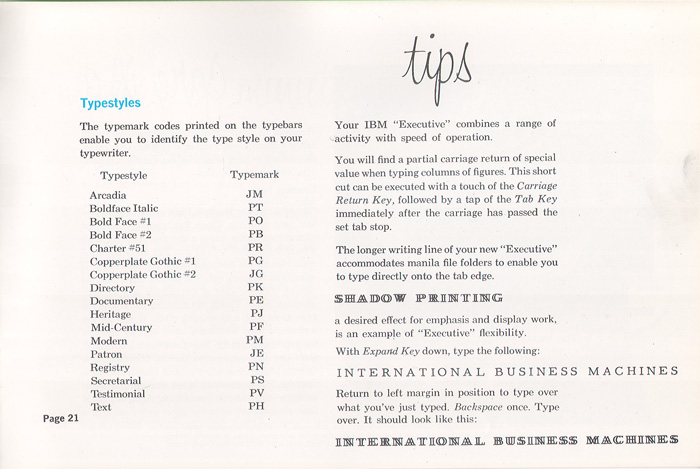
From 1974 to 1985 I was involved in a collective of people who produced a monthly community newspaper in Hackney, the Hackney People’s Press. At the time, it was the most important thing in my life, and I devoted an inordinate amount of time to it. One whole weekend every month was devoted to its layout – typing the text on an IBM golfball typewriter, rubbing down headlines in Letraset, pasting the whole thing up on large sheets of white card. These were delivered to the printers on a Tuesday, and we would then collect finished papers from them on the Friday. The following Saturday would involve driving round various Hackney newsagents, leaving a few copies on sale or return, and collecting the meagre income from the previous month. The next morning, Sunday, a group of three or four of us would meet up on either the De Beauvoir or Holly Street estates, and sell some more copies door to door.

The Centerprise bookshop was far and away the best outlet – some months we would sell 150 or so copies there. Altogether, we might sell a few hundred of each print run, so the paper never broke even. We were just about kept alive by a few ads, the occasional donation and the unpaid toil of a small but dedicated group of people.

Although we were nominally a collective, rotating duties every month, I had the most print production expertise, and so I took on for myself a lot of the design and production decisions. When I first got involved, Crispin Aubrey was the mainstay of the group and he did all the business of liaising with printers and paying the bills. In those days, the paper consisted of a series of backed up A3 sheets, held together with three staples on the left hand edge. The sheets had to be collated and stitched by the collective, which meant another production session after the printing had happened and before we even got onto the streets.

Crispin stood down sometime in the summer of 1975. After a few months, I got together with two or three other people (Hi Andy and Marilyn, wherever you are these days!) and we decided to make an attempt to bring the paper out on our own, using it to look for more people to join us. We decided to give up on the A3 size and produce the paper in A4 format. Although we still had to collate and fold the sheets this was easier than the stapling method. I designed a masthead and made the other design decisions such as what Letraset typefaces to buy.

We continued in this way for a couple of years, and then I found out about a new firm of printers in Morning Lane. It was Turkish-owned and had some sort of tie to a Turkish left group – exactly who, I never found out. But for much the same price as we were producing a 16ppA4 publication, which we had to fold ourselves, we could get an 8pp A3 newspaper, all folded and finished. It was, as people say nowadays, a no-brainer. I designed another masthead, and invested in sheets of Letraset Futura Extra Bold Condensed, which I reckoned was a more authentic font for the headlines of a tabloid size newspaper.

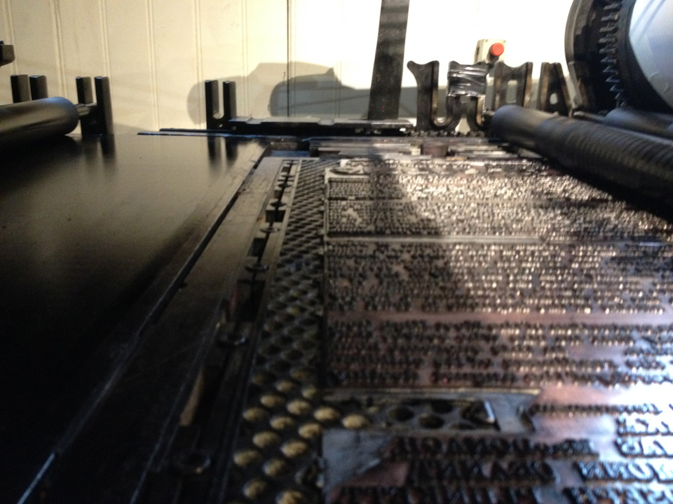
The final change to our production methods came when we moved over to cold-set web press production, and were able to use a red spot colour on the front and back pages. We first went to the SWP’s printer, Feb Edge, just off Hackney Road. A year or two later, the Militant’s printer nearby in Cambridge Heath Road approached us and offered us an even cheaper price, which we were happy to accept. (No room for comradely inhibitions about poaching clients between these two species of Trots.)  Both outfits were pretty paranoid about their security. Their presses had impressive grilles on their windows and you never got closer than a locked front office when delivering artwork or picking up the printed copies.

Quite why the paper stopped in 1985, I’m not sure. We produced an issue in June of that year, but then nothing afterwards. Normally I would have phoned the key members to arrange a meeting to plan the next issue, but for some reason I didn’t. And… no one seemed to notice.

A year or two after this, I broke up with the girlfriend I had been living with through all this period. I took a big pile of back copies when I moved out of our house to the other side of Stoke Newington. Ten years later, married and with two small children, I dumped many of the duplicates into the recycling bin just before we moved to Ireland. And tidying up again, over the years since, I have now pruned my collection down to just one copy of each issue. Back in 2013, I was able to donate an almost complete set of papers to John from the excellent Radical History of Hackney website, and I did an email interview with him, which you can see here. People occasionally still get in touch with me to ask the odd question about the paper, and I am happy to help.

Crispin Aubrey, mentioned above, died suddenly in 2012 at the age of 66. I hadn’t seen him for years, but even then it was a terrible shock. He had been a real mentor to me in my early HPP days, and I used to look up to him with real admiration. His family have set up a fund in his name which helps journalism students at the University of the West of England. Further details here.

Printing the Proclamation

Print MuseumITimesPic: Irish Times

As I wrote above, the printing of the Proclamation of the Irish Republic was a central part of the events of the 1916 Easter Rising in Dublin, and it was commemorated in several different ways during the recent centenary. One of the most authentic experiences was to see a full size replica being printed at the National Print Museum in Beggars Bush Barracks, on a Wharfedale stop cylinder press, similar to the one which was used for the actual printing 100 years ago.
The Museum has a copy of the Proclamation on display, and it was this which was used to make a photo polymer letterpress block. The machine itself, which was once used by the Nenagh Guardian, ran noisily but beautifully, expertly handled by a crew of three veterans, Alf McCormack, Freddie Snowe and William Ryan. This was accompanied by much authentic joshing between the trio as to who had been a compositor and who a printer in their working lives.
To anyone interested in printing history, the Proclamation is a fascinating document, as is explained on the Museum’s website:

The Proclamation is intriguing from a printing perspective. It was type-set and printed in secrecy on a Wharfedale Press in Liberty Hall. As sometimes happened in small printing offices in Dublin, its printers were short of type. Once they had begun their work, it became clear that they would not have enough to set the entire document. The resourceful compositors, Michael Molloy and Liam O’Brien, and printer Christopher Brady, decided to print the document in two halves. Once the top half was finished, they reused their type and set the text for the bottom half. They then locked up this forme and returned it to the bed of the machine. Next, they reinserted the half-printed sheets into the press. A clue to their technique can be seen in some copies of the Proclamation, as one half is more heavily inked than the other.

With the original metal type long gone, the only way of printing it by letterpress is to create a polymer block from a photographic copy, and this can be seen in my photograph below.

IMG_1039 loresThe chase holding the plate can be clearly seen, with the block locked in place with traditional quoins.
A limited edition of 100 copies, produced on a heavyweight paper, was printed on the day. This is still on sale from the Museum shop at €200. However, a more modestly priced unlimited version is also available, printed from the same block on the same Wharfedale press. At just €20, it makes a great present.


That’s for me to know

Virgin trains screenshot

I booked a rail ticket on the Virgin Trains website recently, and this dialogue box cropped up just before I finished. Two things strike me about this kind of intrusive questioning. First, why on earth does Virgin need to know my reason for travel, and exactly how do they intend to “tailor” my journey? I am going to be on a train, for God’s sake, which is scheduled to arrive in London Euston at a specific time. If they were able to tailor my journey, then would they drop me directly at my final destination? I think not.
Secondly, please stop this twee, down-with-the-kids type of questioning. “Hanging with Friends”, “Retail Therapy”, “Working 9-5”. I’m sure the copywriter found these very amusing when s/he thought them up, but it’s the kind of infantile approach to market research that gives market research a bad name. Ugh.
This kind of intrusive questioning is closely related to the stupid security question phenomenon. “Who was your best friend in primary school?” “What is your least favorite nickname.”
Rob Waller’s information design blog has a number of examples of these, plus his own thoughts on intrusive market research. I particularly liked the link I found there to Soheil Rezayazdi’s Nihilistic Password Questions:
“At what age did your childhood pet run away?”
“What is your ex-wife’s newest last name?”
“What sports team do you fetishize to avoid meaningful discussion with others?”

Down the Road Apiece

Stones back lores

After many years without a way of playing vinyl discs, I have recently bought myself a new hi-fi system which includes a turntable. So I dug out a box of old LPs, which was then pounced on by my 22 year old son. “I didn’t know you had all this stuff,” he said, in an approving manner, as he put Dark Side of the Moon onto the turntable. He then showed his ignorance of the technology by failing to select the correct speed, so the disc began playing at 45rpm. Meaningless songs in very high voices indeed.
The record I looked for straightaway was one I used to play all the time at school, The Rolling Stones No.2 album. I was under the impression that for copyright reasons this had never been made available on CD or via download, but I see from Wikipedia that the dispute was actually resolved in 2010. Which shows how up to date I am.
The album opens with a stonking version of ‘Everybody Needs Somebody to Love’. “That’s the song from The Blues Brothers,” said my son. It may be, but it’s actually by Solomon Burke, famous in his later life for doing a great session on a Jools Holland New Year Hootenany while sitting down. In fact, nine out of the twelve songs are R&B covers, and the performances remind us what a great blues band the Stones were in their early days.
When I bought this album, aged 15, I didn’t know a lot about print, or the production of artwork. But I can now see that the sleeve notes and track listings on the reverse seem to have been largely produced on an IBM Electric Executive typewriter with variable character widths, probably one like this:

d-exec
Note the two space bars – one moved the carriage forward by two units, the other by three. To get a single unit space, you had to depress the two unit bar and then backspace by one unit. I remember seeing these still in use in the 1970s, although by then they were largely being superseded by IBM ‘golf ball’ typewriters, which had fixed character widths. An Executive typewriter of this kind was used in the production of Private Eye in this period, although theirs had the more usual seriffed ‘typestyle’, as the IBM literature called it. Here is a list of the typestyles available:

IBM Typestyles lores

Pic: Munk.org

I am not able to track down samples of the actual typestyle used. It does look a little like the later Letter Gothic, but of course that was a fixed space type.
It’s not only the typography which is of note on this album. The two columns of text at the top right of the sleeve, written by Andrew Loog Oldham, is a great piece of hip writing (‘Cast deep in your pockets for loot to buy this disc of groovies and fancy words’). The text namechecks twice the almost forgotten man of Stones management, showbiz agent Eric Easton who (namedrop, namedrop) became a friend of my parents when his daughter went to school with my sisters. Here he is, Mr Easton as we always called him, photographed with Mick Jagger in a picture I found on the Gary Rocks blog.

img_4905

When we knew him, he looked like an archetypal agent with his big Jaguar and cigars. He was eventually dropped by the Stones, and replaced by Allan Klein. He later had a toyshop in Uxbridge, and I did some deliveries for him one Christmas time. But that is another story.

Irish Army uses ‘fake’ 1916 Proclamation for GPO reading

Proclamation Army screenshot
Here is a photograph taken on Easter Sunday 2016 at the event outside the GPO in Dublin which commemorated the 1916 Easter Rising. An officer from the Irish Army read out the text of the famous Proclamation of the Irish Republic, which was published by the rebels on the first day of the Rising. The document which the officer is holding purports to show a copy of the 1916 Proclamation, but it is in fact a later retouched and ‘faked-up’ version. It is the same image which was discussed by the type historian James Mosley in a 2010 blogpost. Mosley’s essay meticulously dissects the various versions of the Proclamation which have appeared over the 100 years since the original was printed in Dublin on the eve of the Easter Rising, and is essential reading for anyone interested in how the image has come to play such an important role in the iconography of the Irish rebellion.

Proclamations 3 lores
Mosley’s essay uses a scan of the real Proclamation from the copy held in the Providence Public Library, Rhode Island, USA. I have placed this side by side with the Army’s version above, and have highlighted the two most prominent differences between the typesetting which show that that it is a later ‘fake’.
The first, and most obvious, are the setting of the words ‘Irish Republic’ in the fourth line down. In the real Proclamation, seen below, the letters can be seen to have suffered quite significant wear and tear, particularly on the first capital R:

3+Proclamation+-+Heading+line+4+Prov+1+bw+a

However, in the ‘fake’, they have been replaced by a later piece of typesetting:

Malins Yeats detail

As Mosley points out, this fake addition must have occurred after 1931, as the typeface used is Gill Sans Extra Bold which was only released that year. The lettering appears to have been ‘distressed’ to a certain extent, perhaps to make it look more like the original. In 1931, Gill Sans Extra Bold was only available in metal letters, but here it is in a modern digitised version:

2+Irish+Republic++-+Gill+Extra+Bold+2+sm

There are several more points which indicate that the item above uses a later version of the Proclamation. Some of these are difficult to see in low resolution but I have highlighted another which is fairly obvious. This is the letter E which appears as the fifth letter of the fifth line, in the word ‘THE’. The men who typeset the Proclamation gave several accounts of their work, and famously told of how they ran out of type for the capital E letter. This one was therefore converted from a capital F with a judiciously placed piece of sealing wax.

Proclamations 2

The blob of wax can be seen clearly above in the ‘original’ on the right, which is compared with the ‘fake’ on the left.
Quite when the ‘fake’ shown above was perpetrated is difficult to tell. Mosley demonstrates that it originates in a book called The Sinn Fein Rebellion Handbook, published by the Weekly Irish Times in May 1916, and reprinted several times shortly afterwards.

Irish Times HandbookPhoto: the easterrising.eu

This contains a ‘copy’ of the Proclamation, which was made from a photographically reproduced line block. This, as would have been the custom in the printing trade at the time, was extensively retouched. The cleaning up of the capital E was amongst the work done then.
Although this retouched reproduction is almost contemporary with the Easter Rising, it is not an exact copy of the actual Proclamation. This has not deterred many people from claiming it is, as can be seen in the many images which can be found all over the internet. It is quite difficult for the lay person to tell the difference between this version and the original. However, the later ‘improvement’ which uses the Gill Sans Extra Bold reset headline is very easy to spot. Quite when (or why) it was done is not certain but it is likely to have been sometime in the 1950s or 1960s. It appears on a range of souvenirs, some of which can be seen below.

Souvenirs lores

The T shirt, bottom left, is part of the merchandise on sale in the Sinn Fein online shop. Sinn Fein also used the same image in some of its literature in the recent election. This particular leaflet was distributed by Aengus O Snodaigh TD.

Proclamation SF election 2016 lores
Original Proclamations can be seen in a number of places in Dublin, including the GPO itself, the National Library and the National Print Museum. The latter has produced a full size facsimile from its own copy of the Proclamation, printed on a Wharfedale press from the same period. It also has more background on how it was typeset and printed.

Further discussion about ‘viral versions’ of the Proclamation here.
Irish Times diary article on James Mosley’s 2011 ATypI Conference presentation.

Adrian Frutiger: Obituary for the Guardian

1427

Obituary for Adrian Frutiger, published in the Guardian, 5 October 2015.

Frutiger attributed some of his skills to the genes he inherited from his ancestors among the farming communities of the Bernese Oberland in Switzerland, where there is a craft tradition of making paper cutouts and silhouettes. After days spent tending livestock or cutting hay, men and women in the region would show remarkable dexterity, using scissors to cut pieces of thin black paper into depictions of scenes from their daily lives. Many of Frutiger’s designs were constructed using large paper proofs that he would then trim with scissors and a knife, shaving a millimetre here and there until he had reached the result he wanted. The letters in all his work show this attention to detail and are always open and clear, allowing the message they convey to be understood without impediment. “Type is the clothing a word wears, so it must be subordinate to the content,” he said.
Read more.